How to Choose Balloon Colors for Your Event (Expert Guide)
A designer's guide to choosing balloon colors — popular palettes, color theory basics, how to match your event theme, and seasonal color trends in Los Angeles.
Color is the single most important design decision for any balloon installation. The right palette transforms a room; the wrong one creates visual chaos. After designing hundreds of events across Los Angeles, I've developed a clear process for choosing colors that work — and I'm sharing it here so you can make confident choices for your own celebration.
Start with Your Event's Mood
Before thinking about specific colors, think about the feeling you want. Soft and romantic? Bold and celebratory? Elegant and minimal? Playful and vibrant? The mood drives the palette.
- Romantic / Elegant: Dusty rose, champagne, sage, ivory, gold chrome
- Fresh / Modern: Dusty blue, white, silver chrome, clear
- Bold / Celebratory: Deep jewel tones — burgundy, navy, emerald, gold
- Playful / Fun: Bright pastels, mixed warm tones, confetti accents
- Minimal / Clean: All-white, white with one accent color, neutral tones
The 60-30-10 Rule
This is the formula I use for almost every installation. It creates balance and visual interest without overwhelming the eye:
- 60% — Dominant color: The base of your installation. Usually a neutral or soft tone.
- 30% — Secondary color: Adds depth and contrast. A complementary or analogous shade.
- 10% — Accent: The pop. Chrome metallics, a bold contrasting hue, or clear balloons.
For example, a baby shower garland might be 60% white, 30% dusty pink, 10% rose gold chrome. A birthday arch could be 60% sage green, 30% ivory, 10% gold chrome.
Popular Palettes by Event Type
Weddings
Wedding balloon decor trends lean heavily toward muted, sophisticated tones. My most requested wedding palettes right now:
- Sage + dusty rose + ivory + gold chrome
- All-white with champagne and pearl accents
- Dusty blue + white + silver chrome
- Terracotta + cream + olive
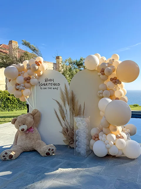
Baby Showers
Baby shower palettes have moved beyond basic pink and blue. Current favorites:
- Dusty blue + white + sand + silver chrome (boy)
- Blush + mauve + cream + rose gold chrome (girl)
- Sage + cream + tan + gold chrome (gender neutral)
- Lavender + white + lilac + pearl (whimsical)
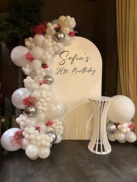
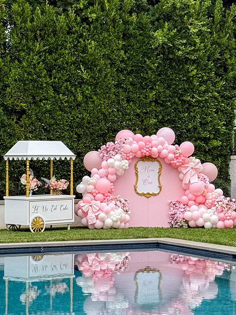
Birthdays and Milestones
Birthday palettes are where clients get the most creative:
- Black + white + gold chrome (glamorous milestone)
- Bright rainbow gradient (kids' parties)
- Burgundy + navy + gold (elegant 40th, 50th)
- Custom brand colors (corporate events)
Matching to Your Invitation and Venue
Your invitation suite is a great starting point, but I never match it exactly. Colors behave differently at different scales — a beautiful deep plum on a 5x7 card can feel heavy when scaled to a 10-foot arch. I use your invitation as a mood reference and adjust the palette for the three-dimensional, large-scale application.
Venue colors matter too. I always ask about wall colors, flooring, and lighting. A warm-toned venue (wood floors, warm lighting) calls for a different palette than a cool, modern space with white walls and bright lighting. Balloon colors shift noticeably under different light sources.
Seasonal Palettes in Los Angeles
While LA doesn't have dramatic seasons, event aesthetics still shift throughout the year:
- Spring (March–May): Pastels, garden-inspired, lavender and green
- Summer (June–August): Bold, tropical, bright whites with pops of color
- Fall (September–November): Terracotta, rust, olive, warm neutrals
- Winter (December–February): Rich jewel tones, metallics, deep greens, white and gold
Finishes and Textures
Color isn't just about hue — finish matters as much. The same shade looks completely different in matte, pearl, and chrome:
- Matte / Standard: Soft, natural, photographs true to color
- Pearl / Shimmer: Subtle glow, elegant, great for weddings
- Chrome / Metallic: Reflective, dramatic, perfect as a 10% accent
- Double-stuffed: One balloon inside another creates unique custom shades and a richer look
My Process
During every design consultation, I create a custom color palette based on your event details, venue, and inspiration. I source specific balloon shades from professional suppliers — not retail stores — which gives access to hundreds of precise tones. Before production, I share the palette for approval so there are no surprises on event day. You can learn more about my full design process on the about page.
Not sure where to start? Send me your inspiration images — a Pinterest board, a fabric swatch, your invitation — and I'll build a palette from there. Color is where every great installation begins.
Common Color Mistakes to Avoid
- Too many colors: Stick to 3-5 colors maximum. More than that creates visual chaos instead of a cohesive palette.
- Ignoring the venue: A neon palette that works in a white-walled studio looks garish in a dark-wood restaurant. Always factor in wall color, flooring, and lighting.
- Matching invitations exactly: Printed colors and balloon colors render differently at scale. I work from the invitation as a starting point, then adjust for how the palette reads in the actual venue.
- Forgetting about finish: The same color in matte, chrome, and pearl creates three completely different looks. Finish selection is as important as color choice.
Frequently Asked Questions
How many balloon colors should I choose for my event?
Should balloon colors match my event invitations?
What are the most popular balloon color palettes right now?
Do balloon colors look different in person than in photos?
Written by
Alina
I design and install custom balloon installations for events across Los Angeles. Every project is personal.
Check Availability →